Unlocking Data Insights: The Power and Principles of Effective Dashboard Design
July 28, 2023 | Read Time : 3 mins
Table of Contents
Organizations and individuals rely heavily on data to make informed decisions. However, the abundance of data can be overwhelming, making it challenging to extract valuable insights. This is where dashboards come into play. Dashboards serve as visual representations of data, providing a comprehensive overview of key metrics and facilitating data analysis.
In this blog, we will explore what dashboards are, the different types of dashboards, essential design principles, and real-world examples of effective dashboard implementations.
What is a Dashboard?
A dashboard is a user interface that presents complex data in a simplified and visual manner. It acts as a control panel, displaying relevant information, metrics, and key performance indicators (KPIs) in a consolidated view.
Dashboards are designed to help users monitor and understand data quickly, enabling them to make data-driven decisions efficiently. They typically include charts, graphs, tables, and other visual elements to represent data visually and intuitively.
Types of Dashboards
1. Strategic Dashboards
- Focus on high-level performance metrics and long-term goals.
- Provide a bird’s-eye view of the organization’s overall performance.
- Often used by top-level executives and managers for strategic decision-making.
2. Operational Dashboards
- Display real-time or near-real-time data to monitor ongoing operations.
- Help track operational efficiency and identify potential issues.
- Commonly used by supervisors, team leads, and frontline employees.
3. Analytical Dashboards
- Designed for in-depth data analysis and exploration.
- Offer interactive features, drill-down capabilities, and advanced data visualization techniques.
- Suited for data analysts and business intelligence professionals.
4. Tactical Dashboards
- Focus on specific departmental or functional areas.
- Provide targeted insights and metrics to support tactical decision-making.
- Used by middle management and department heads.
Dashboard Design Principles
To create effective and user-friendly dashboards, it is crucial to adhere to the following design principles:
- Keep it Simple: Avoid clutter and unnecessary complexity. Present only the most relevant and actionable information. Use clear and concise language to communicate data.
- Use Visual Hierarchy: Prioritize and organize information based on importance. Utilize visual cues such as size, color, and placement to guide attention. Group-related elements to enhance comprehension.
- Choose the Right Visualizations: Select appropriate chart types that best represent the data. Consider the audience’s familiarity with different visualizations. Balance aesthetics with clarity and accuracy.
- Provide Context: Present data in meaningful contexts to facilitate understanding. Include historical trends, benchmarks, and targets. Provide explanations or tooltips for complex metrics or acronyms.
- Ensure Responsiveness: Optimize dashboards for various devices and screen sizes. Prioritize mobile-friendly designs for on-the-go access. Maintain consistent functionality across different platforms.
- Emphasize Usability: Design intuitive navigation and interaction elements. Allow users to customize and personalize the dashboard. Incorporate search, filtering, and sorting options for data exploration.
Inspiring Dashboard Implementations
Several real-world examples demonstrate the successful implementation of dashboards across different industries and purposes. These examples showcase how effective dashboard design can enable organizations to gain valuable insights and make informed decisions.
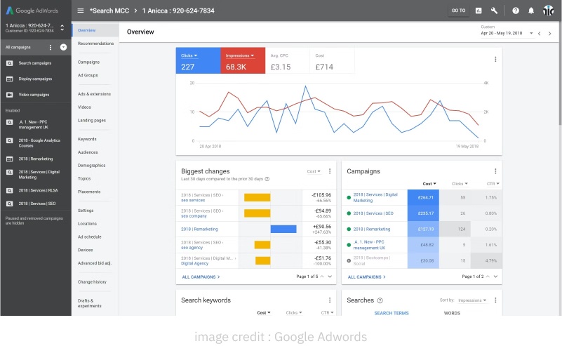
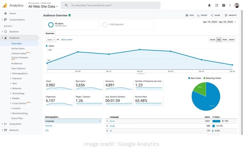
Google Analytics
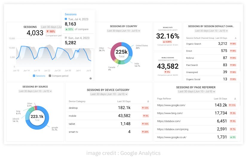
One prominent example is Google Analytics, a widely used web analytics tool. Its dashboard provides users with comprehensive insights into website traffic, user behavior, conversion rates, and more. Using line graphs, bar charts, and tables, Google Analytics presents data clearly and easily understandable. This allows website owners and marketers to track key metrics, identify trends, and optimize their online presence.
Trello
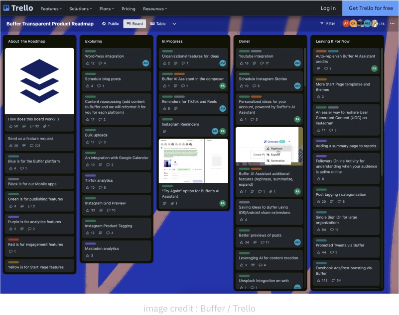
Another notable dashboard can be found in Trello, a popular project management tool. Trello’s dashboard is designed to visualize project progress and facilitate team collaboration. It employs Kanban boards and cards to represent tasks and their status. By providing a single view of ongoing projects, deadlines, and team members’ contributions, Trello empowers users to track workflows, identify bottlenecks, and ensure project success.
Salesforce
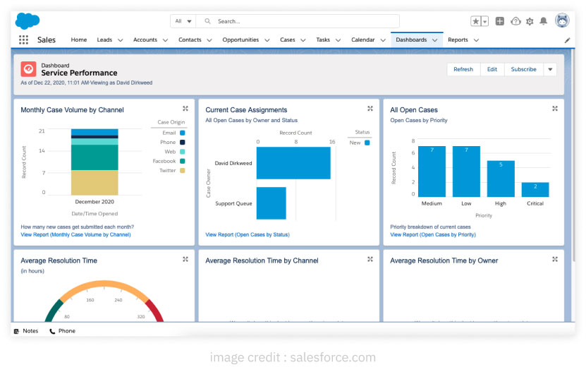
Salesforce, a leading CRM platform, offers customizable dashboards tailored for sales and marketing teams. These dashboards provide real-time data on sales pipeline, lead conversion rates, revenue, and other key performance indicators. Through charts, gauges, and metrics, Salesforce allows users to monitor their performance at a glance. These insights enable sales and marketing professionals to optimize strategies, drive revenue growth, and enhance customer relationships.
Tableau
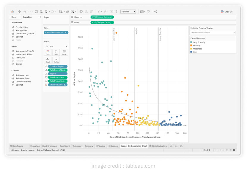
Tableau, a powerful data visualization software, allows users to create interactive dashboards. It offers diverse visualizations, including heat maps, scatter plots, treemaps, and more. Tableau’s dashboards empower users to explore data in-depth, uncover patterns, and tell impactful stories with data. With its intuitive interface and flexible design options, Tableau enables businesses and analysts to gain actionable insights and communicate data effectively.
AUTHOR
Team OriginUX
OriginUX Studio is a CoE for User Experience providing UI & UX across Product, Service and Customer Experience Design. We are a cross-disciplinary design team that loves to create great experiences and make meaningful connections for businesses and their users through UI & UX.
Founded in 2016, our larger purpose is to help brands understand what they want to do and where they want to go. To do that we have to make understanding customer experience simple, effortless, and affordable for everyone.
Related Articles

Navigating the Path to Insights: A Guide for Problem Solvers

Designing a Great Business: The Blueprint for Success
Elevating Business Success through Strategic UX Design
OriginUX studio is based out of Bangalore, India.
We are a cross-disciplinary design team that loves to create great experiences and make meaningful connections for businesses and their users through UI & UX.