SAAS Dashboard UX Design Best Practices
July 22, 2018 | Read Time : 3 mins
Table of Contents
Introduction to SaaS and dashboards
SaaS stands for Software as a Service. A company that makes money through subscriptions qualifies as a SaaS company.
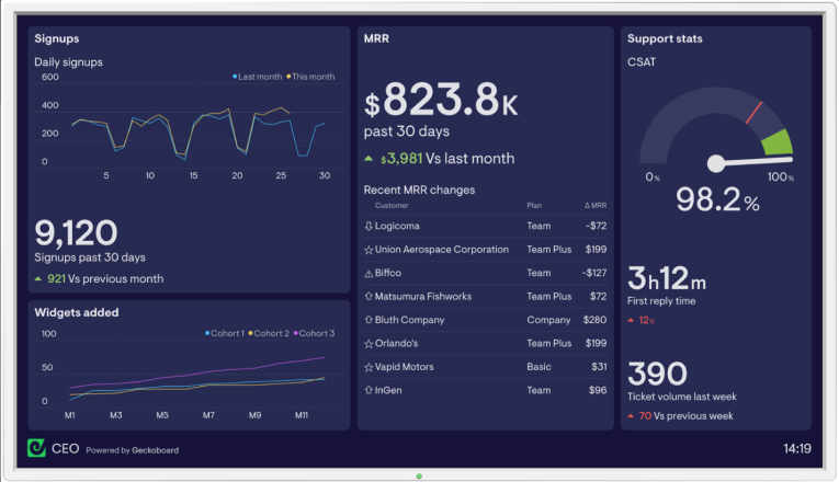
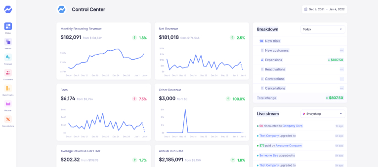
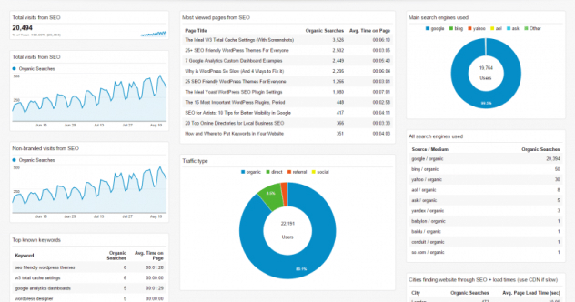
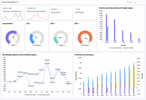
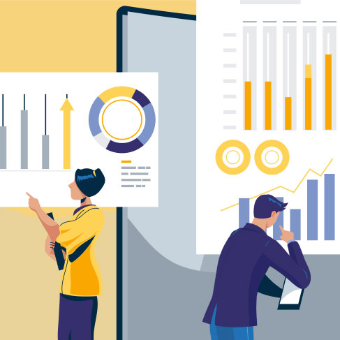
Dashboards are the visual display of important information like KPIs and metrics in a visually understandable form like charts, widgets, lists, and graphs that are needed to achieve an objective. The biggest benefit of the dashboard is its simplicity. They are customizable to meet the specific needs of a department and company.
“The designer’s purpose in designing a data visualization is to create a deliverable that will be well received and easily understood by the reader. All design choices and particular implementations must serve this purpose.”
– Noah Iliinsky and Julie Steele, from Data Visualization
An analytics dashboard is an effective way to analyse business growth. A well-designed dashboard shows information in a unique but simple way. It is a business’ dream to have a dashboard that presents all data while showing trends, risky areas and updates. Real-time monitoring reduces the hours of analysing and long lines of communication that previously challenged businesses.
What is SaaS Dashboard?
A SaaS dashboard is a monitoring and data collection tool that brings together KPIs and metrics directly that are related to the online distribution software. This dashboard is designed to accumulate the expanding needs of SaaS business owners and operators. SaaS businesses often benefit from having more, and directly sourced data that is easy to monitor and automate.
Importance of Dashboards for SaaS companies
After deciding on what type of dashboard is required according to the problem that needs to be solved, you may ask, why are dashboards even required? Dashboard collects key metrics from sales, finance, customer support, and marketing all in one place so you can find problems and tackle them at the initial stages. Dashboards can be called a Launchpad for making key decisions.
Based on insights gained from the dashboard, companies can set clear priorities and directions for their business. User research helps create an environment in which users are presented with data that is relevant, clear, and concise.
Companies can focus on goals and achieve them faster by fixing any problems at the initial stage. Now, dashboards come in various types and sizes and they may all seem equally appealing to meet your ends but they serve different problems. This leads to the next sub-topic here, types of dashboards.
“Metrics are for doing, not for staring. Never measure just because you can. Measure to learn. Measure to fix.”
– Stijn Debrouwere
Below are five reasons why you should consider dashboards for your SaaS business.
Monitor multiple metrics at once
The most efficient factor of having a dashboard is its ability to showcase multiple metrics using KPIs in one environment.
Cloud- accessibility
Modern data dashboards are now accessible using the cloud. This means that it can be accessible for multiple users at the same time, irrespective of their location.
Easy to access
Dashboards are designed in such a way that users are directly provided with the most important data while accessing the digital environment.
Accelerates growth
By tracking data that matters the most and making data-driven decisions, internal teams can adapt new strategies and stimulate improved metrics.
Types of Dashboards
An important factor in business growth is choosing the correct type of dashboard for your business. In today’s data-driven world, dashboard types are changing the way a successful business strategy is conducted. To decide the type of dashboard it is key to understand what kind of problems need to be solved.
Let’s take a look at three types of dashboards namely, Operational, Analytical and Strategic.
Operational Dashboard
Operational Dashboards look at real-time analytics of your business. They help organizations understand if their performance is on track. These can be used to display critical information that is time relevant. They are mostly used for monitoring and analysing a company’s activities in a given business area.
Analytical Dashboard
Analytical dashboards represent key data sets to users that are reflected against previous performances. They supply businesses with a comprehensive overview of data. These have to be data-centric and need to show as many data-related views as possible. They are often useful when complex categorized information is massive and broad, and need visualization to perform a clear analysis of generated data.
Strategic Dashboard
Strategic dashboards are used to monitor long term company strategy with the help of success factors. They are used to indicate performance against a set of KPIs. They track performance metrics against enterprise-wide strategic goals.
Characteristics of Dashboards
An intuitive dashboard always makes sense. Dashboards display the essential real estate portfolio data in an easily digestible visual form to impart a sense of a portfolio’s performance. Fitting everything in without sacrificing meaning doesn’t require much, it just requires finesse.
To deliver the right data at first glance, an effective dashboard must:
Align with goals
Because investors have different goals and objectives, it is important to define the purpose of the investor. It is essential to keep the good KPIs in mind that help show progress.
Use the right visuals
Investment goals drive data visualization used for dashboards. The goal is to diversify the data.
Place numbers into context
Investors need to be able to see the relationships between key data sets so as to understand the bigger picture. Well-designed dashboards group related data sets so users can understand influences quickly.
Include only required information
Well-designed dashboards must deliver information that is exceptionally well organized and condensed.
Keep data current
An effective dashboard must provide data that helps users modify their performance according to real-time market changes. If investment goals change, it leads to change in primary measurement.
Tell a Story
The best dashboards must connect the past, present, and future. All dashboards should have the option to drill down further into the numbers, but without cluttering the initial desktop.
Practices to follow for great Dashboard UI
Before we proceed to practices, it is important to look at the different components that finally leads up to these practices. The first of these is elements of a dashboard.
It is firstly important to outline the story. Having familiarity with the data and business context equips the company with being able to find important insights and support users with meaningful metrics.
Performing analysis is to share what has been found so as to make an important decision must be considered a crucial element of a dashboard. It is the outcome of these first steps that project onto the dashboard. The understanding the audience is critical and it goes without saying.
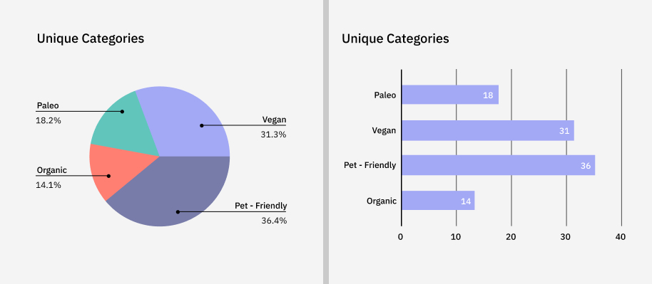
In terms of visual representation, it is key to choose the right type of chart. Choosing the right chart will make a difference in making sure the most important trends and comparisons get called out or obscured. If the charts created obscure the findings, then ultimately the message is lost and no action is taken. You must ultimately choose the chart that most people are familiar with.
Charts and dashboards are easily interpreted when including additional text for context and applications. At a minimum, a chart should have a title that includes details about the measures being displayed.
Choose the right colour when it comes to representing your data. These colours shouldn’t clash with one another but should be enough in contrast to where it doesn’t distract the user.
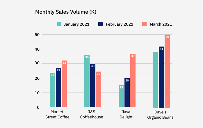
Here, the colours are all over the place and there’s no connection between them making it look uneven. It’s as if the focus is on the colours and not the data itself.
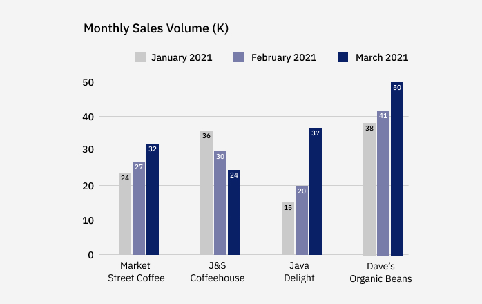
In the below example, the colours are of a similar tone and do not take away from the data being visualized. When using colour, be strategic and minimalistic.
Something else that could be looked at and considered is designing dashboards for mobiles and tabs.
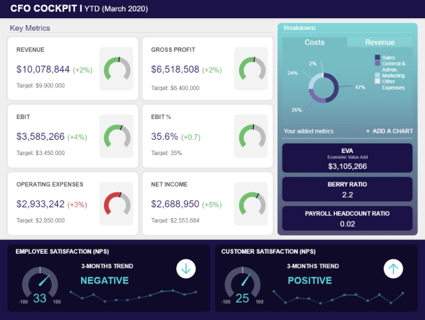
A mobile dashboard is a data analytics tool used to track important key performance indicators (KPIs) and display them visually on a mobile device. They are insightful and interactive consoles that use configurable elements (such as search results, lists, filters, matrixes, gauges, and charts) to drill down into data, analyze, predict trends, and display critical metrics and information relevant to users.
Mobile dashboards often have more benefits. They allow access to data to be referenced in real-time. There is improved access to real-time data. Organizations can incorporate mobile dashboards into their strategic planning to create new or improved business models. With improved access to data, employees can share data more easily than ever. Sharing is further improved when dashboards include an interactive capability that allows users to send information.
Following are some things you can keep in mind while designing mobile dashboards-
- Keep it Simple
The less involved and complicated the dashboard is, the easier it will be to fit in additional functionality. Simple and minimal dashboard designs minimize clutter, enabling users to easily see and access dashboard elements.
- Responsive Design
It is essential to create dashboards that are responsive to the screen of any device so they can be used consistently across interfaces. This can be accomplished by developing dashboards within a mobile application or using HTML-based responsive code, which can be accessed in a web browser.
- Minimize the use of filters
The right set of filters helps mobile workers better leverage reports and mobile dashboards. Although filters enable users to quickly access different data views, they are best kept to a minimum on mobile devices.
- Contrast
Since the screen sizes of mobile devices are smaller than those of desktop devices, it’s best to create aesthetically pleasing interfaces for mobile dashboards.
- Limit the number of Elements
For mobile dashboard design, simplicity is key. The more design elements in a dashboard or report, the harder it is for users to make sense of the data. It’s easier to make out important values when information is presented in a simple datasheet rather than flashy charts with lots of data points and colours.
After discussing the above sub-topics that come under Dashboard UI, let’s go through a few practices that one can follow for great Dashboard design.
Know your Audience
Great dashboard design is possible when you know your target audience. It is best to know who you are catering to so as to create the best design. User research helps in understanding users.
Responsive Dashboards
Responsive design in a dashboard allows users to decide the data they want to focus on. Easily understood UI allows the user to control what data they need in the front and centre of the dashboard.
Dynamic dashboards
A Dynamic Dashboard enables multiple users to access a dashboard that was previously accessed only by a single static user. This means that the dynamic dashboard can be used by a specific user alongside a logged-in user, and display data specific to both users accordingly.
Choose the right colours
Without a doubt, this is one of the most important of all dashboard design practices. The colours you choose often represents the identity of your company. You can either stick to the signature colours of your brand or choose 2 to 3 and play around with gradients of those.
Personalize over Customize
Users expect that the content they see will be relevant to their individual needs. Giving users more power to customize the dashboard is a good initiative, as long the view is already personalized.
Design the dashboard last
While the dashboard is visually the component to look forward to the most, it is recommended to cover elements within a dashboard and then come to it. It is more practical to design it in the end.
By using the best and most balanced dashboard design principles you will ensure that everyone who visits your company and those within the organization can identify key information with ease, which will only accelerate the growth, development and evolution of your business.
AUTHOR
Team OriginUX
OriginUX Studio is a CoE for User Experience providing UI & UX across Product, Service and Customer Experience Design. We are a cross-disciplinary design team that loves to create great experiences and make meaningful connections for businesses and their users through UI & UX.
Founded in 2016, our larger purpose is to help brands understand what they want to do and where they want to go. To do that we have to make understanding customer experience simple, effortless, and affordable for everyone.
Related Articles

Beyond the Numbers: Understanding the Significance of MRR in SaaS Business Growth
Essential Metrics for a Thriving SaaS Business

SaaS Growth Blueprint: A Comprehensive Guide for Startups
OriginUX studio is based out of Bangalore, India.
We are a cross-disciplinary design team that loves to create great experiences and make meaningful connections for businesses and their users through UI & UX.