Discover how to create clear and impactful Data Visualisation Dashboards
July 18, 2023 | Read Time : 3 mins
Table of Contents
Organizations rely heavily on data to make informed decisions and gain actionable insights in today’s data-driven world. However, raw data alone is often overwhelming and difficult to comprehend. That’s where data visualization dashboards come into play. These powerful tools enable businesses to transform complex data into clear, intuitive, and impactful visual representations. In this blog, we will explore the key principles and best practices to help you create data visualization dashboards that effectively communicate information and drive meaningful outcomes.
Understanding the purpose of your dashboard
- Define the objectives: Clearly articulate the purpose of your dashboard. Is it to monitor key performance indicators, track progress toward goals, identify trends, or support decision-making processes? Understanding the goals will guide your design choices.
- Identify the target audience: Know who will be using your dashboard. Consider their level of expertise, specific information needs, and preferred visual presentation styles. This understanding will enable you to create a user-centric dashboard that resonates with your audience.
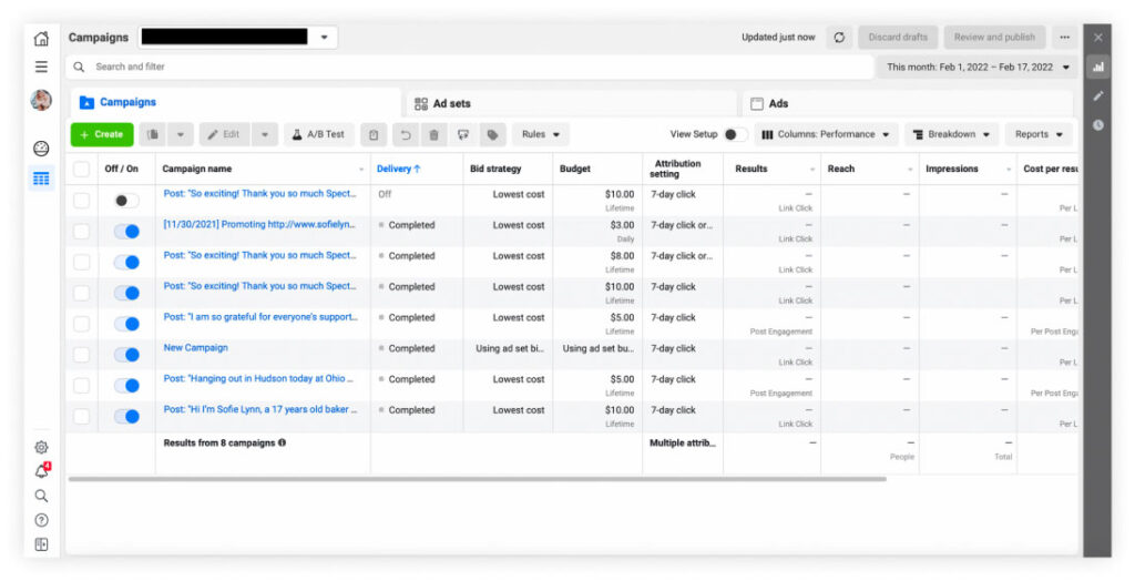
Facebook’s Ads Manager provides advertisers with a comprehensive dashboard to track the performance of their ad campaigns. The dashboard includes visualizations of key metrics such as reach, impressions, clicks, conversions, and cost per result. Advertisers can analyze the data to optimize their campaigns, target specific audiences, and maximize their return on investment.
Designing for clarity and simplicity
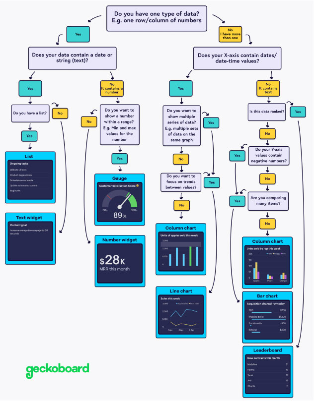
- Choose the right visual elements: Select visual representations that align with the nature of your data and effectively convey the intended message. Common options include bar charts, line graphs, pie charts, and heat maps. Avoid clutter and excessive use of visual elements that confuse or distract users.
- Utilize appropriate color schemes: Colors play a crucial role in data visualization. Use colors strategically to highlight important information and establish visual hierarchies. Ensure color choices are consistent, accessible, and meaningful.
- Please keep it simple and focused: Avoid information overload by presenting only the most relevant and actionable data. Streamline your dashboard to display key metrics and insights that drive decision-making. Use clear headings, labels, and concise descriptions to enhance understanding.
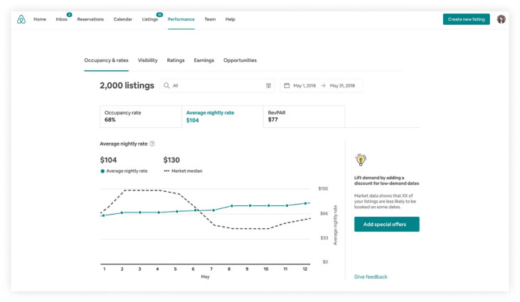
Airbnb uses data visualization dashboards to provide hosts with insights into their property’s performance and booking trends. Hosts can access visualizations that display occupancy rates, pricing comparisons, and revenue generated. The clear and impactful visualizations help hosts make data-informed decisions regarding pricing, availability, and optimizing their listing.
Enhancing interactivity and user experience
- Provide interactive elements: Incorporate filters, drill-down options, and hover-over tooltips to allow users to explore data in-depth. Interactivity empowers users to customize their views, uncover hidden patterns, and gain deeper insights
- Optimize for responsiveness: Ensure your dashboard is accessible across various devices and screen sizes. Responsiveness enhances usability and allows users to access critical information on the go.
- Include contextual information: Provide relevant context within your dashboard to aid comprehension. Annotations, captions, and trend lines can help users understand the story behind the data and draw meaningful conclusions.
Iterative development and continuous improvement
- Gather user feedback: Regularly seek input from dashboard users to understand their needs and pain points. User feedback is invaluable for identifying areas of improvement and refining your dashboard’s effectiveness.
- Iterate based on insights: Incorporate user feedback and data-driven insights to enhance your dashboard’s design and functionality. Continuously refine and evolve your visualization to ensure it remains aligned with changing requirements and user expectations.
Selecting the right data and metrics
- Identify key data sources: Determine the sources of data that are most relevant to your dashboard’s objectives. Consider data from internal systems, external APIs, third-party sources, or manual inputs. Ensure data quality and consistency to maintain the integrity of your visualizations.
- Define meaningful metrics: Choose metrics that align with your objectives and provide actionable insights. Avoid using too many metrics that may overwhelm users. Focus on those that directly contribute to decision-making and drive business outcomes.
Ensuring data accuracy and validity
- Identify key data sources: Determine the sources of data that are most relevant to your dashboard’s objectives. Consider data from internal systems, external APIs, third-party sources, or manual inputs. Ensure data quality and consistency to maintain the integrity of your visualizations.
- Define meaningful metrics: Choose metrics that align with your objectives and provide actionable insights. Avoid using too many metrics that may overwhelm users. Focus on those that directly contribute to decision-making and drive business outcomes.
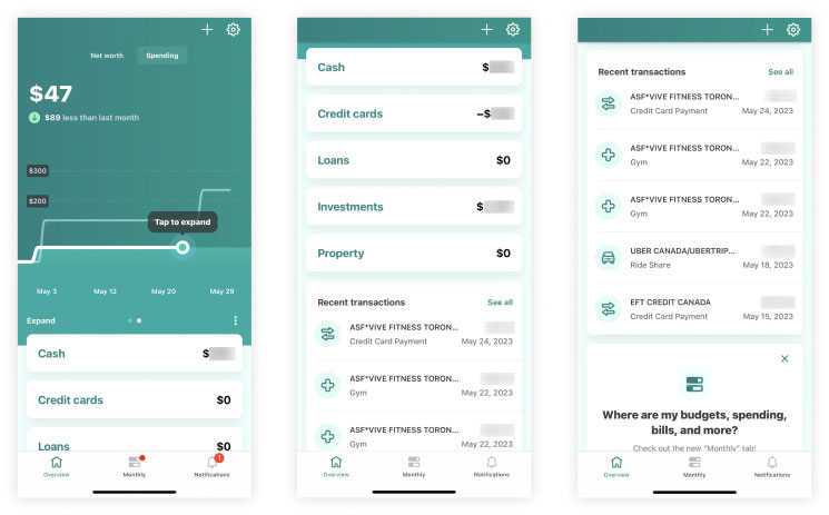
Mint is a personal finance app that offers users a dashboard to track their spending, budgeting, and financial goals. The dashboard provides visualizations of income, expenses, and savings in an easy-to-understand format. Users can visualize their financial habits, identify areas for improvement, and make informed decisions about their spending and saving behaviors.
Choosing the right visualisation tools and technologies
- Evaluate available tools: Research and evaluate different data visualization tools and technologies that suit your requirements. Consider factors such as ease of use, scalability, interactivity, and compatibility with your data sources. Choose tools that offer a wide range of visualization options and customization capabilities.
- Leverage advanced features: Explore the advanced features of your chosen visualization tool to enhance the effectiveness of your dashboards. Features like real-time data updates, geospatial mapping, or predictive analytics can provide deeper insights and enhance user engagement.
Applying design principles for visual hierarchy
- Establish visual hierarchy: Organize your dashboard elements based on their importance and relationship to one another. Use size, color, and position to create a clear visual hierarchy that guides users’ attention to the most critical information first.
- Group related elements: Grouping related data elements helps users understand the connections and relationships between different data points. Use consistent spacing, borders, or background colors to visually group related components.
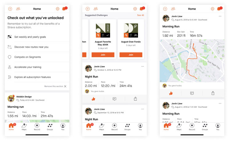
Strava is a social fitness app for runners and cyclists that offers a dashboard to track and analyze workouts. Users can visualize their routes, distance covered, pace, and elevation gain. The dashboard also allows users to compare their performance with others and set personal records. Clear visualizations help users monitor their progress, set new goals, and stay motivated.
Telling a compelling story with data
- Define a narrative: Structure your dashboard to tell a coherent story. Start with an engaging title or headline and guide users through a logical flow of information. Use annotations or text boxes to provide context and highlight key insights.
- Incorporate data storytelling techniques: Use storytelling techniques to make your data come alive. Incorporate compelling visuals, charts, and graphs that evoke emotions and resonate with your audience. Combine data with explanatory text to provide meaningful interpretations and actionable takeaways.
Conducting usability testing and user training
- Conduct usability testing: Test your dashboard with representative users to evaluate its usability and effectiveness. Gather feedback on navigation, clarity, and ease of understanding. Use this feedback to make necessary improvements and optimize user experience.
- Provide user training and documentation: Offer training sessions or documentation to familiarize users with the dashboard’s features and functionality. Provide clear instructions on how to interpret and interact with the visualizations. Help users build confidence and make the most of the dashboard’s capabilities.
Ensuring data security and confidentiality
- Implement robust security measures: Safeguard the data within your visualization dashboards by implementing appropriate security protocols. Use encryption methods to protect sensitive data during transmission and storage. Apply access controls and user authentication mechanisms to ensure only authorized individuals can access the dashboards.
- Comply with regulatory requirements: Consider the legal and regulatory requirements pertaining to data privacy and security, such as GDPR or HIPAA. Ensure your data visualization practices align with these regulations to maintain data confidentiality and protect user privacy.
Monitoring and evaluating dashboard performance
- Establish performance metrics: Define key performance indicators (KPIs) to measure the effectiveness of your data visualization dashboards. Metrics such as user engagement, data accuracy, and decision-making impact can provide valuable insights into the dashboard’s performance.
- Continuously monitor and analyze usage data: Monitor user behavior, interaction patterns, and feedback to gain a deeper understanding of how your dashboard is being utilized. Leverage analytics tools to track metrics, identify areas for improvement, and make data-driven decisions to enhance dashboard performance.
AUTHOR
Team OriginUX
OriginUX Studio is a CoE for User Experience providing UI & UX across Product, Service and Customer Experience Design. We are a cross-disciplinary design team that loves to create great experiences and make meaningful connections for businesses and their users through UI & UX.
Founded in 2016, our larger purpose is to help brands understand what they want to do and where they want to go. To do that we have to make understanding customer experience simple, effortless, and affordable for everyone.
Related Articles

Navigating the Path to Insights: A Guide for Problem Solvers

Designing a Great Business: The Blueprint for Success
Elevating Business Success through Strategic UX Design
OriginUX studio is based out of Bangalore, India.
We are a cross-disciplinary design team that loves to create great experiences and make meaningful connections for businesses and their users through UI & UX.