Designing Data Visualization for Data-Intense SaaS Applications
March 6, 2023 | Read Time : 3 mins
Table of Contents
People often say that information is power, but given that knowledge often comes in the form of data (lots of data), how
can businesses use knowledge to their advantage?
Data Visualisation is the solution. It will enable you to visualise vast amounts of detailed information in graphs, charts,
and diagrams to make it more understandable, instructive, and memorable.
However, Data Visualisation is difficult, so you might need to collaborate with someone who has done it before.
Why is Data Visualization important?
Our brain processes an image at roughly 13 milliseconds, 60,000 times faster than text. Verify it on your own. Exactly which of the two indications is simpler to understand?
Therefore, visual data representation is effective because it offers the type of communication our brains require. Since humans are biologically wired to see the world visually, visualising data boosts the content’s impact and effectiveness by facilitating the information’s perception, processing and retention.
Additionally, organisations might benefit from customising their data visualisation and information design.
- Speed up data-driven decision-making
- Quickly detect data flaws or discrepancies, efficiently analyse enormous amounts of information, and learn
about the newest market trends - Rapid analysis of crucial metrics
- Get information instantly and help with managerial tasks.
But when trying to identify the best type of visualisation for your scenario, it’s so simple to become lost in all those charts, tables, forms, and colours. Let’s outline the requirements for producing high-quality data visualisations.
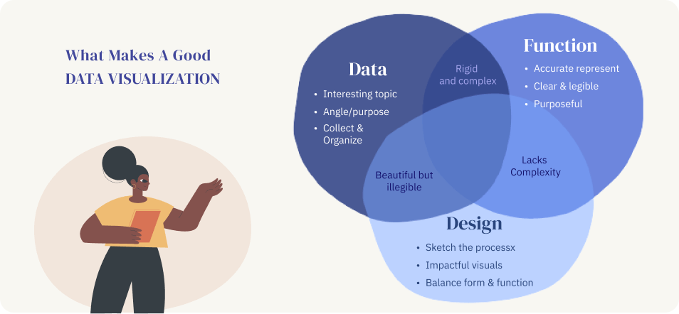
What makes good data visualisation essential?
What are the ideal techniques for Data Visualisation?
We’ve compiled a collection of best practices for Data Visualisation design and arranged them according to the areas of color, comparison, relationship, ordering, and dashboards to assist you in avoiding frequent data design blunders and generally improving your handling of data visualisation.
Color
Colour is a great tool for designing data visualisations that enables you to

Here are a few suggestions for using color correctly in data visualisation designs.
- Don’t overuse colors to divert the attention of your audience: One layout should not use more than six colors. Use colour accents (for data you wish to highlight) and neutral colours (for the rest of the data) to generate contrast and focus. Use a single hue with varying saturations to show amounts or numbers of continuous data. It will be simpler for readers to comprehend if they see changes in a certain measure if only one colour is used.
- Be careful to utilise a single color in various saturations to denote quantities or numbers of continuous data: It will be simpler for readers to understand if they see changes in a certain metric if only one color is used.
- Mind color associations: Data visualisation designers employ colors to facilitate comprehension and trigger associations. At the same time, beware when using colors with strong associations (like red and green) as they may flip the meaning in users’ minds.
- Make clever use of contrast: It may not be easy to distinguish between tones that are too similar to one another, which is when contrast is useful. Contrarily, avoid color combos like red/green or blue/yellow that have a lot of contrast.
Comparison
You may compare two data sets to see how they differ in various categories. Data comparison can be used to demonstrate changes through time or highlight the differences between various groups.
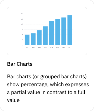
Designers frequently employ bar charts (or grouped bar charts) to communicate proportion, which expresses a partial value in contrast to an absolute value, to show comparison.
Relationship Diagrams
Relationship diagrams show the connections between different parts. For instance, the cost of software may vary depending on how many users it will have and how many advanced features you want.
Explore these charts to investigate the connections between data sets
- Network charts are used to analyze the structure of a network by evaluating node clustering, the degree of connectedness between nodes, and the diagram’s design.
- Venn diagrams are used in visual communication to depict relationships between groupings of items, make predictions, highlight similarities and contrasts, and consider the explanation for such ideas.
Here’s some suggestions about visualizing relationship diagrams
- Don’t only use icons to represent key information on chart nodes; pair them with labels to help the user understand the data.
- Ranking Data are arranged in a particular order using ranking charts. When rank is visualized, our brains recognize it right away. As a result, you may provide your audience with engaging stories using ranking data charts.
Dashboards
A good dashboard should be simple to use, communicate the key metrics and goals of the company, and not be overwhelmed with data indicators.
- In some circumstances, it may be necessary to display data using a grouping of several charts or a dashboard, to express a story more effectively.
- A good dashboard should be simple to use, explain the essential metrics and goals of the company, and not be
overwhelmed with data indicators. - A good data visualisation should motivate the viewer to investigate the data and help them fully comprehend what
they see. - Even yet, dealing with intricate, data-intensive goods requires a skilled design team, so having them on your side may be helpful.
Here are few important suggestions to consider for creating charts
- To provide greater context for comparison, always begin the chart with an x-axis value of 0.
- Don’t use many pie charts to show changes over time (comparing the size disparity between each pie slice is
challenging). Instead, use bar charts to show progression over time or differences between several groups. - Don’t include too many groups in your charts to avoid making them appear deceptive (it’s normally best to
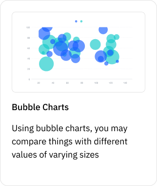
compare up to five categories). - Be sure to evenly space the bubbles when you plot the bubble chart; if that’s not feasible, you may display
overlapping bubbles by altering the opacity or blending mode.
AUTHOR
Team OriginUX
OriginUX Studio is a CoE for User Experience providing UI & UX across Product, Service and Customer Experience Design. We are a cross-disciplinary design team that loves to create great experiences and make meaningful connections for businesses and their users through UI & UX.
Founded in 2016, our larger purpose is to help brands understand what they want to do and where they want to go. To do that we have to make understanding customer experience simple, effortless, and affordable for everyone.
Related Articles

Navigating the Path to Insights: A Guide for Problem Solvers

Designing a Great Business: The Blueprint for Success
Elevating Business Success through Strategic UX Design
OriginUX studio is based out of Bangalore, India.
We are a cross-disciplinary design team that loves to create great experiences and make meaningful connections for businesses and their users through UI & UX.