Best Alternatives to Hamburger Menus and When to Use Them
January 8, 2020 | Read Time : 3 mins
Table of Contents
Being a UI designer, you must have definitely heard of the term hamburger menus. Even if you haven’t, you would have most certainly seen it. A hamburger menu is a three-line icon, resembling the structure of a hamburger which is placed at the top left corner of a website or an application. The menu expands to showcase a list of options or features provided by an application or a website. It was and still is being used in many websites and applications.
The main reason hamburger menus gained widespread popularity was because of their ability to reduce clutter in an application. These menus provide a way to conceal a list of options or features under an aesthetically pleasing minimalist icon.
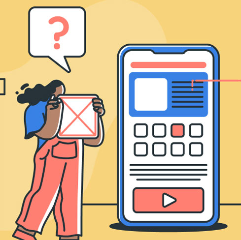
Limitations of Using Hamburger Menus
While hamburger menus provide designers with an ample amount of space to work their charm on a webpage, they also have certain drawbacks that hamper the success of the application adversely.
Here is a list of some limitations of using hamburger menus:
Placement
Hamburger menus are generally placed on the top-left corner of the screen. The location of the menu makes accessing it difficult while using a mobile phone hence discouraging engagement. In some cases, the navigation tools of the phone’s operating system overlap with the hamburger menus, thus rendering them meaningless.
Also, in most cases, the top-left corner of the screen is used to display additional information on a smartphone such as battery life, Wi-Fi connection, applications in the background, etc. It is highly probable that users do not notice the menu due to its placement in the insignificant region of the screen.
Hidden features
The main idea behind the invention of the user interface tool was to declutter the screen. However, placing features in the hamburger menu decreases their importance. When placing features in the hamburger menu, designers indirectly suggest that the features do not add any great value to the application for the users.
Furthermore, hamburger menus force users to work hard to figure out which options are on offer. In doing so, the user interface tool fails to highlight the features that make the application stand out.
Alternatives to Hamburger Menus
Here is a list of the alternatives that can help designers overcome the shortcomings of hamburger menus:
Tabs
If you have a fewer number of pages or features to display to the user, you can use a tabbed navigation. A tabbed navigation is a menu displayed either at the top or bottom of the page. Users can easily navigate to different pages with a single click or tap on the screen. The presence of the menu on the homepage immediately makes the core content and features of an application evident to the users.
The tabs further aid in organising content into categories making the interface even more user-friendly. Furthermore, the navigation tool informs the user of its current positioning in the application by visually highlighting the tab that is in use. Tabbed navigation is used when there are five or fewer sections in which the application can be divided into.
Tabs + More
The tabs+more form of navigation is used when there are more than five sections in the application. As a UI designer, you need to prioritise the sections based on their importance and usage. On the basis of this prioritisation, the four most important sections should be displayed on the home screen while all other pieces of secondary information should be stored in a “more” tab. The more tab could be designed as a drop-down menu listing other items or could link to another page that displays the remaining options.
Progressively collapsing menu
Another sophisticated alternative for the tabs+more navigation is the progressively collapsing menu. The menu depicts the tabs on the basis of the screen width. The screen displays as many options as possible based on its width and places the rest of the options under the more tab. It simply means the more menu of the navigation consists of the lower priority options which could not be accommodated on to the screen due to its width. The navigation option offers a flexibility over tabs+more navigation especially when it comes to in-between screen sizes.
Inline
You can also lay out the categories or sections of an application as a list on the homepage. You can use labels, icons, or headers to specify the category of the content. The lists can further redirect the user to a different page to display the details of the option selected.
All of the above-mentioned options are the most popular alternatives to hamburger menus that are being used by famous tech companies.
However, hamburger menus can still be used effectively. After making the primary components of an application prominent, you can use a hamburger menu to list all the secondary navigation options. As a designer, you need to use your judgment and experience to choose from the array of navigation options available and use them to make your application stand out in the competitive market.
AUTHOR
Team OriginUX
OriginUX Studio is a CoE for User Experience providing UI & UX across Product, Service and Customer Experience Design. We are a cross-disciplinary design team that loves to create great experiences and make meaningful connections for businesses and their users through UI & UX.
Founded in 2016, our larger purpose is to help brands understand what they want to do and where they want to go. To do that we have to make understanding customer experience simple, effortless, and affordable for everyone.
Related Articles

Navigating the Path to Insights: A Guide for Problem Solvers

Designing a Great Business: The Blueprint for Success
Elevating Business Success through Strategic UX Design
OriginUX studio is based out of Bangalore, India.
We are a cross-disciplinary design team that loves to create great experiences and make meaningful connections for businesses and their users through UI & UX.
Industries we serve