- Who We Help
-
Capabilities
Product DesignProduct DevelopmentAIGrowth & SupportProduct DesignProduct DevelopmentSoftware DevelopmentWeb Application Development (SaaS, PWA, Portals)Full Stack DevelopmentEnterprise Software DevelopmentDatabase Architecture & EngineeringWeb Development ServicesCMS DevelopmentSoftware Architecture & WireframingMobile App DevelopmentSoftware DevelopmentWeb Application Development (SaaS, PWA, Portals)Full Stack DevelopmentEnterprise Software DevelopmentDatabase Architecture & EngineeringWeb Development ServicesCMS DevelopmentSoftware Architecture & WireframingAIGrowth & SupportSoftware & App Maintenance Website Maintenance Performance Optimization (Speed, UX, Code) App Store Optimization (ASO) Feature Iteration & Versioning Conversion Rate Optimization (CRO) Analytics Setup & Reporting CRM & 3rd Party Tool Integration Tech Support & SLA-based Services Security Audits & Compliance
- Solutions
- Industries
- Design-Ops
- Technologies
- Company
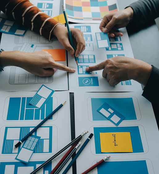
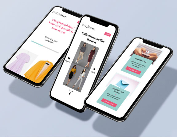
Create Consistent User Interfaces With Component-Based Design
Your digital product should look the same every time someone sees it, no matter what platform they use. That’s why Design Systems & Component Libraries matter. When everything is built from the same base, teams can move faster, fix fewer bugs, and deliver a better experience for users. At Origin UX, we help you bring structure into your product design. We build systems that organize your UI elements, define your brand rules, and make it easier to scale your product. With everything stored in one place, your team wastes less time asking questions and more time building real things.
0+
Reusable UI Components Built
0+
Design Systems Rolled Out Across Industries
0%
Less Design Debt
Our Approach
Our Approach to Building Design Systems
Every brand is different. That’s why our Design System Approach is always tailored. We start by understanding your values, your users, and your product goals. From there, we define the pieces that make up your system.
We work with you to define the values behind your design, so everyone on the team knows what good looks like and why it matters. We create consistent components, spacing systems, and layout rules that can be used across screens and products, saving time and improving consistency.
For every component we design, we provide code that developers can use right away, speeding up implementation and keeping design and engineering in sync.
Your system doesn’t sit still. It is designed to grow with your product and team.
Major Design Services to Build Smarter Systems
Design System Strategy
We define a strategic design system tailored to your brand and product, aligning designers, developers, and stakeholders from the start.
Component Library Creation
Our component libraries provide reusable UI elements that speed up development and ensure consistent design across platforms.
Visual Language and Guidelines
We build a unified visual language, including typography, color palettes, iconography, and imagery, so your brand feels polished everywhere.
Documentation and Training
Clear design system implementation guides and training sessions help your team adopt the system quickly and use it effectively.
Maintenance and Iteration
We continuously refine components and guidelines based on user feedback and evolving product needs, keeping your system up-to-date and scalable.
The Step-by-Step Method We Follow
Discovery
We begin by reviewing everything you already have: design files, code components, brand assets, and product screens. This helps us understand what’s working, what is missing.
Strategy
Next, we define the goals and purpose of your design system. We map out the structure, what it should include, and how it will support your product and team.
Development
We start building reusable UI components, layout rules, tokens, and design patterns that work across different screens and use cases. Developers and designers make sure everything is scalable.
Documentation
We write clear, visual documentation with real examples showing when and how to use each component, what it should look like, and how it behaves in different contexts.
Implementation
Once the system is ready, we help roll it out. That means supporting your design and dev teams as they integrate it into real projects, and offering hands-on training so everyone’s aligned and confident.
A Closer Look at Our Core Offerings

Design System Strategy and Visual Language
We start by defining a strategic design system tailored to your product and brand. This includes establishing a unified visual language with clear typography, color palettes, and iconography. By aligning designers, developers, and stakeholders, we ensure every component supports a consistent user experience. Our approach reduces design debt and sets a foundation for scalable and reusable UI elements.

Component Library Creation and Reusable Elements
We create component libraries with fully reusable UI elements such as buttons, forms, modals, and cards. Each component is coded cleanly, tested, and documented so developers can implement them confidently. This approach accelerates development, reduces inconsistencies, and ensures every interface looks and feels aligned across platforms.

Documentation and Training
Clear design system implementation is critical for adoption. We provide comprehensive documentation and conduct training sessions, so your team knows how to use, maintain, and extend the system. This empowers designers, developers, and product managers to collaborate effectively and reduces errors or confusion during handoffs.

Maintenance & Iteration
A great design system evolves with your product. We continuously refine and expand components based on feedback, ensuring scalability and longevity. By updating shared documentation, revisiting component libraries, and keeping your system in sync with your tech stack, we make sure your team can deliver consistent, high quality experiences at every stage.
Empowering Teams Across Sectors
Banking
Complex interfaces need clarity. Our component libraries streamline workflows, reduce design debt, and help teams ship secure, user friendly financial tools.
SaaS
We create strategic design systems that allow developers and designers to reuse components, speeding up feature releases while maintaining consistent experiences.
Retail
Consistent branding across web, mobile, and apps is key. Our systems provide a unified visual language to keep product experiences seamless for customers.
Healthcare
From patient portals to admin dashboards, we ensure interfaces are intuitive, accessible, and consistent, improving trust and efficiency.
E-Learning
Interactive courses and dashboards are easier to manage with reusable UI elements, helping students and educators navigate digital platforms effortlessly.
Enterprises
Multi-team collaboration becomes frictionless with shared component libraries and documented design systems, reducing errors and aligning cross functional workflows.
Clients who trust us


Why Origin UX Is the Right Partner
Working with Origin UX means more than just getting a system. It means getting a Best Design System Agency that cares about your success.
Whether you are just getting started or managing multiple products at scale, we know how to tailor systems that meet your stage, speed, and structure. Our process brings all disciplines into one conversation. We make sure your system works not just in theory, but in real workflows, with real teams.
Our systems help teams design and build faster, with fewer inconsistencies and less rework. That means shorter cycles, better handoffs, and real cost savings over time. We help you build something that will grow with you, with clear guidelines, room to evolve, and a structure your team can trust.
We’re here to make your design operations smarter and more efficient.
What You Will Gain With a Strategic Design System?
Faster Development Cycles
With component libraries, your team reuses tested UI elements, reducing repeated work and accelerating development timelines.
Consistent User Experience
A unified visual language ensures all interfaces look cohesive across platforms, building trust and recognition for your brand.
Reduced Design Debt
By implementing a strategic design system, teams avoid reinventing components, minimize inconsistencies, and focus on solving real problems.
Enhanced Team Collaboration
Shared guidelines and component libraries align designers, developers, and product managers, improving communication and reducing friction.
Scalable and Future Ready
Our systems evolve with your product, allowing your team to add features confidently while maintaining high quality, consistent designs.
Building Smarter with the Right Tech


Design & Prototyping Tools
We use Figma, Sketch, and Adobe XD to craft wireframes, prototypes, and visual assets that are precise, reusable, and developer-ready.


Front-End Frameworks
React, Vue, and Angular ensure smooth integration and scalable development across platforms.

Component Libraries
We use Storybook and custom libraries to document, preview, and test components, making handoffs faster and collaboration smoother.


Version Control
With Git, GitHub, and cloud-based tools, teams maintain version control, streamline workflows, and iterate efficiently on design systems.
FAQ
OriginUX studio is based out of Bangalore, India.
We are a cross-disciplinary design team that loves to create great experiences and make meaningful connections for businesses and their users through UI & UX.
Industries we serve