- Who We Help
-
Capabilities
Product DesignProduct DevelopmentAIGrowth & SupportProduct DesignProduct DevelopmentSoftware DevelopmentWeb Application Development (SaaS, PWA, Portals)Full Stack DevelopmentEnterprise Software DevelopmentDatabase Architecture & EngineeringWeb Development ServicesCMS DevelopmentSoftware Architecture & WireframingMobile App DevelopmentSoftware DevelopmentWeb Application Development (SaaS, PWA, Portals)Full Stack DevelopmentEnterprise Software DevelopmentDatabase Architecture & EngineeringWeb Development ServicesCMS DevelopmentSoftware Architecture & WireframingAIGrowth & SupportSoftware & App Maintenance Website Maintenance Performance Optimization (Speed, UX, Code) App Store Optimization (ASO) Feature Iteration & Versioning Conversion Rate Optimization (CRO) Analytics Setup & Reporting CRM & 3rd Party Tool Integration Tech Support & SLA-based Services Security Audits & Compliance
- Solutions
- Industries
- Design-Ops
- Technologies
- Company
5 outstanding UI design features from leading SaaS Products
March 23, 2023 | Read Time : 3 mins
Table of Contents
We rely on cloud apps for most of our day-to-day activities, from ordering meals or booking a cab to taking notes or relaxing with meditation apps. Due to this immersive use of apps in daily lives, customers expects simple and quick solutions to their everyday problems. Hence, the role of UI/UX Design in an application is to make any activity simple, convenient, and quick.
Principles that make a good SaaS design great
Researching SaaS competitors is a crucial element of the product design process. It will be beneficial in identifying the best design decisions and incorporate them into the product. Here, four major principles are derived from preceding cases.
Principles that make a good SaaS design great
Researching SaaS competitors is a crucial element of the product design process. It will be beneficial in identifying the best design decisions and incorporate them into the product. Here, four major principles are derived from preceding cases.
- Consider simplicity in your design, and avoid overwhelming the interface with irrelevant elements.
- Never overlook people with varying abilities.
- Utilize common design patterns to assist users in quickly adopting the product.
- Provide users with ready-made templates to reduce their time to value.
5 UI design features of top SaaS products
Toggl’s onboarding
Toggl is a simple time-tracking application that allows people and teams to monitor where their work time is going, establish billable rates, check reports, and so on. The main benefit of this app is that it requires very little effort.
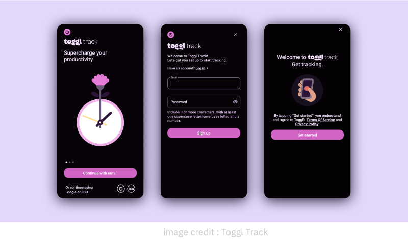
Toggl’s design is a fantastic example of SaaS onboarding since it teaches:
- Short onboarding: To avoid overwhelming customers with too much information at once, Toggl structured their onboarding process into short tours that educate how to use essential features.
- Helpful reminders: Modal windows with reminders on how to return to onboarding allow users to learn when it is convenient for them.
- Allow users to skip onboarding: Each tooltip and modal window allows users to skip onboarding, which minimizes friction and makes the informative tour transparent. Users should constantly feel like they have control over each function in an application.
- Visual hierarchy: The content in each tooltip is easily noticeable since it is large enough and contrasts well with the backdrop. This guarantees that users of different skills can complete the onboarding process.
Headspace’s accessibility options
Headspace is a cloud-based meditation tool that helps users manage stress, relax, focus, and remain healthy. The design for accessibility is one of its distinctive features. In its accessibility menu, a widget can be activated that assists people with cognitive difficulties to easily perceive the content. This is a step forward in guaranteeing that all users can access the product equally.
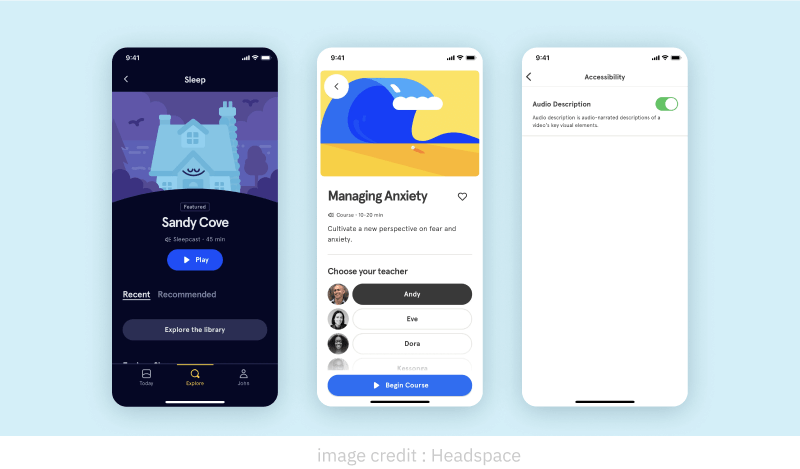
What we can learn from Headspace’s SaaS design:
- Inclusive UX: Taking care of accessibility is essential for every contemporary business since it allows a larger audience to obtain information from your product and helps you to remain inclusive.
- Adjustable content: Headspace not only offers enough contrast, clear navigation, and well-labeled buttons to allow users to easily engage with the software, but they also designed the whole menu to assist people of varying abilities adjust the content on their website as they like.
Typeform’s template collections
With the help of the SaaS platform Typeform, users may create interactive and interesting online forms and surveys that will generate more responses. The huge library of survey & questionnaire templates offered by Typeform makes it quick and easy for people to select the template that best expresses their ideas.
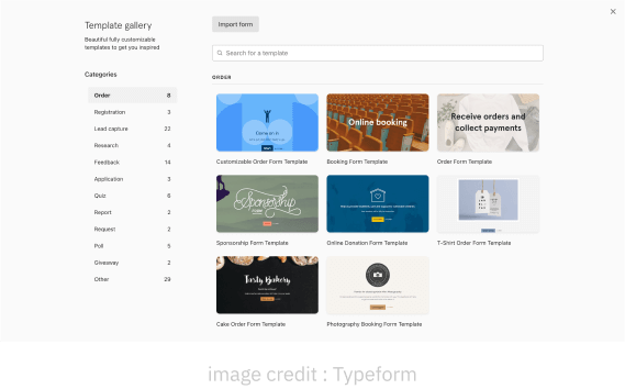
Typeform’s a strong example of SaaS design as it demonstrates:
- Well-organized and simple to navigate: A simple and clear list of categories and a search bar helps users in finding the required template as soon as possible.
- Simplistic template design: Each interface component and element of content on the templates serves a certain purpose. The correct amount of white space and contrast prevent user distractions and generate templates that are light and simple to read.
- Quick editing: Each button on the editor is emphasised clearly, making the designs easy to use.
Invision’s error prevention cards
To create and manage prototypes, designers and developers use the cloud-based design platform Invision. It has a feature that requires the user to manually check three boxes to prevent users from accidentally deleting the prototype. This way, they ensure their customers think twice before deleting their creations.
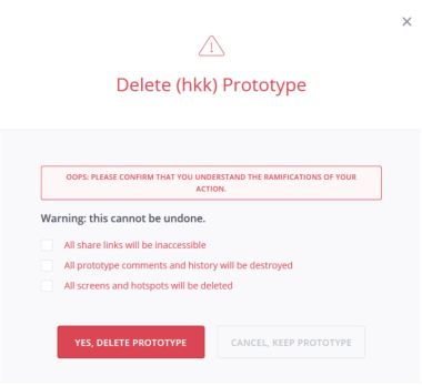
Invision is a good example of SaaS design:
- Eliminates user frustration: Although intuitive design speeds up task completion, there are times when relying on automated thought can result in users being dissatisfied and mistakes being made that cannot be corrected. People are more likely to read the information next to the checkboxes and make the right decision when they are asked to confirm the action.
- Utilizing checkboxes: It guarantees that users take action and, as a result, plainly comprehend the choice they make.
Canva’s over-all presence
Canva’s web presence is known for its user-friendly and intuitive interface, making it easy for both beginners and professionals to create stunning designs.
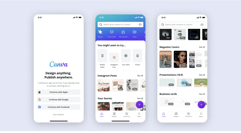
What we can gain from this SaaS design:
- Optimization: The interface is optimized for various web browsers and is mobile-responsive, ensuring that users can access the platform from any device or location.
- User-friendly interface: Canva is user-friendly and makes it easy for users to navigate and create designs. The interface is simple and intuitive, which makes it accessible for both beginners and experienced users.
AUTHOR
Team OriginUX
OriginUX Studio is a CoE for User Experience providing UI & UX across Product, Service and Customer Experience Design. We are a cross-disciplinary design team that loves to create great experiences and make meaningful connections for businesses and their users through UI & UX.
Founded in 2016, our larger purpose is to help brands understand what they want to do and where they want to go. To do that we have to make understanding customer experience simple, effortless, and affordable for everyone.
Related Articles

November 16, 2023
UX Design Strategies That Can Redouble Your Retention
User Experience (UX) plays a pivotal role in retaining users. A well-designed UX can keep users engaged, satisfied, and...

June 14, 2023
Digital Information: A Trap or a Treasure
Introduction In an era of rapid technological advancements and unprecedented access to information, the digital landscape has become a...
June 14, 2023
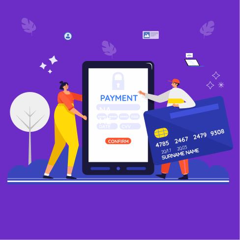
The future of electronic wallets and payments: Changing how we pay
Introduction In an increasingly digital world, electronic wallets and payments have emerged as key drivers of financial innovation. With...
OriginUX studio is based out of Bangalore, India.
We are a cross-disciplinary design team that loves to create great experiences and make meaningful connections for businesses and their users through UI & UX.
Industries we serve
© OriginUX Studio 2016 - 2026