SaaS Dashboard: The Architecture of Your Business Growth
March 9, 2023 | Read Time : 3 mins
Table of Contents
Is business booming for you? Are there any barriers to its expansion? What aspects need to be improved? The SaaS KPI dashboard answers these questions in seconds and provides you with an overview of your company’s health and wealth.
SaaS Metrics Dashboard: what is it?
KPI and metrics should be your primary focus when determining how quickly your SaaS business grows. Analysing conventional numerical records requires much effort, time, and concentration. SaaS Analytics Dashboards are useful tools for monitoring, analysing, and displaying data and KPIs in easily readable formats, including charts, widgets, lists, and graphs. The dashboard’s simplicity is its main advantage.
Dashboard gathers key metrics from sales, finance, customer service, and marketing in one place, allowing you to identify and address problems early on. We can describe it as a starting point for making strategic choices.
Why is a SaaS Dashboard required?
- Using a SaaS analytics dashboard allows everyone in the organization to view, study the data, and discover more about how the business is doing.
- Dashboards let you understand the current state of the business by displaying various indicators.
- Helps Identify problems early on so we can assess them immediately and change our direction before they spiral out of hand.
- A strategic SaaS dashboard tailored to your company can serve as a great foundation and set the pace for the future growth journey.
Types of SaaS Dashboards
Most companies fail to establish the objective of their dashboard and instead create one that fulfils multiple purposes.
They typically end up with messy goals and priorities.
Consider the following three types of SaaS Dashboards to help you outline your requirements:
Analytical Dasboards
Analytical dashboards are used to study patterns or deeper insights to understand what happened in the business and what adjustments you should make in the future. Product managers and business analysts typically utilise them.
Strategic Dashboard
CEOs mostly use strategic dashboards to emphasise top-level KPIs for the organisation. These dashboards show company performance across certain periods, such as the previous month, quarter, or year.
Operational Dashboard
Operational dashboards raise employee awareness by tracking each team’s day-to-day activities in real time. They aid in the early detection of issues.
Key Metrics to measure SaaS Dashboards
Key KPIs for SaaS Dashboards may change depending on the type of product. These dashboard measures reflect the heart of a company’s health and stimulate its growth.
MRR (Monthly Recurring Revenue)
The acronym speaks for itself; it refers to the anticipated monthly revenue fluctuation.
Client acquisition cost (CAC)
The average price for acquiring a new customer.
LTV (Lifetime Value)
The revenue generated by an average customer to your company throughout the customer’s life (before they churn).
LTV/CAC Ratio
By comparing a customer’s lifetime value to the acquisition cost, you may decide how much money you should spend to acquire them.
Average Revenue Per Account, or ARPA
The average monthly, quarterly, or annual revenue generated from each customer.
Churn
The proportion of clients discontinuing their membership (calculated monthly).
Retention
The proportion of devoted customers (calculated monthly).
Expansion
A monthly income generated from existing customers. For example, any expected upsells, add-ons, or upgrades to current accounts contribute to expansion.
Using North Star Metric to foster growth
The NSM points you in the right direction, like a Polaris star. You might be wondering what the North Star Metric is. A crucial indicator of the success of your product is North Star Metric. You must use it as a point of focus to advance. What benefit does your product provide its users the most? What features of your product are essential to them? Or, if you prefer, do your customers have an “aha” moment while utilizing your product for the first time?
The North Star Metric, which defines this moment, drives corporate growth.
Design and Structure of SaaS KPI Dashboard
A dashboard’s informational architecture, in addition to measurements, is what makes it an effective analytics tool. From the first glimpse, it must deliver the message. The following advice may be used while building your SaaS analytics dashboard:
Context
To determine if the metrics are excellent or poor, context must be provided. By context, I mean comparing the previous month’s outcomes, industry standards, or your ambitions.
Consistency
Use a maximum of three graph kinds (preferably two), so your dashboard does not feel repetitive. Bar or line charts are excellent options for monitoring trends over a certain amount of time. However, pie charts are useful for proportional analysis. Choose the most appropriate graphs to make your dashboard clear and easy to read.
Use of appropriate colour
Color helps us easily spot good or terrible trends at a glance by creating visual signals. Colour misuse and overuse are two errors to avoid. They both produce confusion and diversion. As a result, a dashboard might often appear to be a blank canvas.
Numbers
To be precise, round percentages to decimals and financial indicators to thousands (rarely hundreds). The majority of dashboards do not require high-precision statistics to represent every cent. Such material takes your attention away from the dashboard’s primary goal, which is to alert you of the situation quickly.
Size and position
Interconnected metrics should be grouped; high-priority metrics should be shown on the top left of a dashboard with a larger font size.
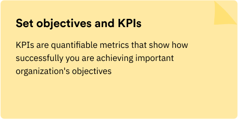
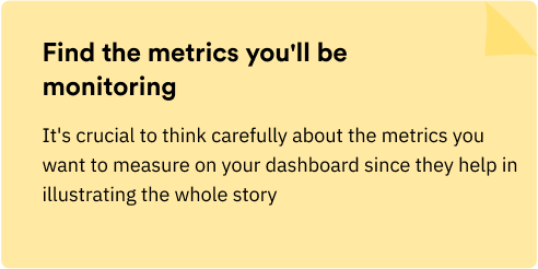
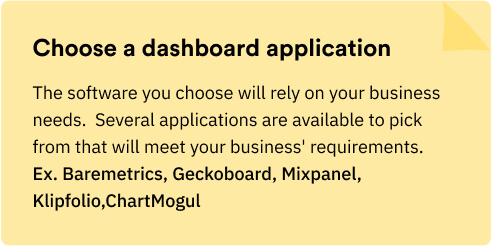
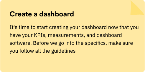
How to create a SaaS Analytics Dashboard?
The five steps to creating a SaaS dashboard are as follows:
An analytics dashboard’s genuine importance cannot be underestimated. You can gain practical information that can help your business grow if you:
- Define your needs
- Keep the dashboard basic and uncluttered
- Share the dashboard with the team
Once you are aware of the metrics that are growth drivers, you may continue building more detailed dashboards for the various divisions of your company. The attention they receive will certainly be helpful to everyone.
When you understand the growth metrics, analyze regularly and focus your and your team’s efforts on driving them, you are on the right track to business success.
AUTHOR
Team OriginUX
OriginUX Studio is a CoE for User Experience providing UI & UX across Product, Service and Customer Experience Design. We are a cross-disciplinary design team that loves to create great experiences and make meaningful connections for businesses and their users through UI & UX.
Founded in 2016, our larger purpose is to help brands understand what they want to do and where they want to go. To do that we have to make understanding customer experience simple, effortless, and affordable for everyone.
Related Articles

Navigating the Path to Insights: A Guide for Problem Solvers

Designing a Great Business: The Blueprint for Success

Elevating Business Success through Strategic UX Design
OriginUX studio is based out of Bangalore, India.
We are a cross-disciplinary design team that loves to create great experiences and make meaningful connections for businesses and their users through UI & UX.