- Who We Help
-
Capabilities
Product DesignProduct DevelopmentAIGrowth & SupportProduct DesignProduct DevelopmentSoftware DevelopmentWeb Application Development (SaaS, PWA, Portals)Full Stack DevelopmentEnterprise Software DevelopmentDatabase Architecture & EngineeringWeb Development ServicesCMS DevelopmentSoftware Architecture & WireframingMobile App DevelopmentSoftware DevelopmentWeb Application Development (SaaS, PWA, Portals)Full Stack DevelopmentEnterprise Software DevelopmentDatabase Architecture & EngineeringWeb Development ServicesCMS DevelopmentSoftware Architecture & WireframingAIGrowth & SupportSoftware & App Maintenance Website Maintenance Performance Optimization (Speed, UX, Code) App Store Optimization (ASO) Feature Iteration & Versioning Conversion Rate Optimization (CRO) Analytics Setup & Reporting CRM & 3rd Party Tool Integration Tech Support & SLA-based Services Security Audits & Compliance
- Solutions
- Industries
- Design-Ops
- Technologies
- Company


Revamp your Designs using Powerful Heuristic Methods
February 10, 2023 | Read Time : 3 mins
A Heuristic Evaluation may be used to determine how user-friendly a website is. In other words, it evaluates how usable the website is. In contrast to user testing, where users review the website (or prototype), Heuristic Evaluation assesses the website using usability experts. Because of this, it’s sometimes referred to as an “expert review.”
Heuristics can be compared to general guidelines. A set of predetermined heuristics or qualitative guidelines serve as the foundation for a heuristic evaluation or expert review of a web or mobile site.
Here is a brief synopsis of powerful heuristics.
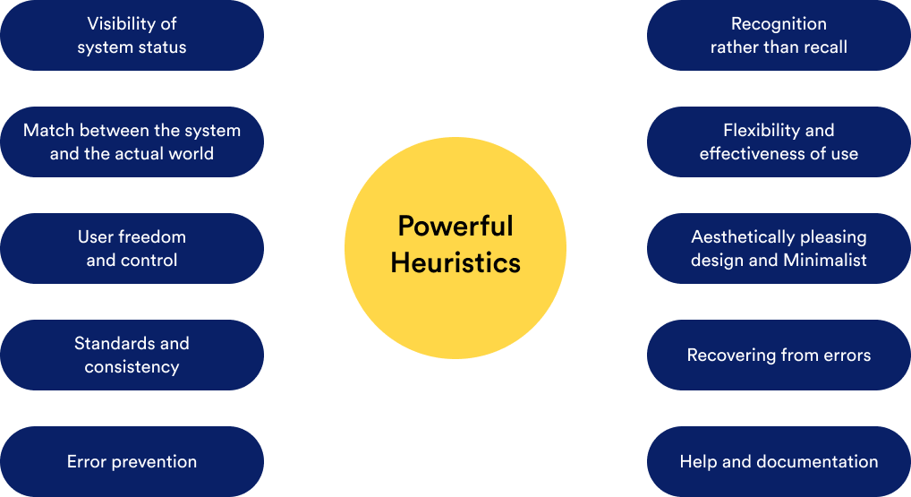
Flexibility in Everything
The system should tell users of its status by providing appropriate feedback in a timely manner.
Match between the system and the actual world
The system should employ words, ideas, and concepts familiar to the user rather than system-oriented jargon. Follow real-world conventions by arranging information in a natural and logical sequence.
User freedom and control
Users frequently pick system functions incorrectly; therefore, they want a clear “emergency exit” to quickly and discreetly depart from the unwanted state. Support undo and redo options.
Standards and consistency
Users shouldn’t be left wondering whether several words, circumstances, or actions refer to the same thing. Follow the platform conventions.
Error prevention
Careful design that foresees problems before they arise is preferable compared to just error messages. Eliminate error-prone circumstances, check for them, and provide users with the option of confirmation before they commit to an action.
Recognition rather than recall
Minimize the user’s memory burden by making items, actions, and alternatives apparent. The user shouldn’t feel the necessity to recall details from one section of the dialogue to the next. When necessary, instructions for using the system should be readily visible or accessible.
Flexibility and effectiveness of use
Accelerators may frequently speed up the interaction for the expert user so that the system may accommodate both beginner and experienced users. New users are often unaware of accelerators’ existence, which can often be done. Permit users to customise routine tasks.
Aesthetically pleasing design & minimalist
Dialogues shouldn’t include irrelevant information. Every additional bit of information in a conversation competes with the relevant bits of information and minimizes their relative exposure.
Help users in recognizing, diagnosing, and recovering from errors
Error messages should be written in simple language (i.e., without any codes), clearly state the issue, and offer a workable solution.
Help and documentation
Even though it is ideal if the system may be operated without documentation, it might be required to offer help and documentation. Any such information should be concise, focused on the user’s task, easy to search, and describe specific actions that need to be taken.
Using these established guidelines for best-usability practices, you may either develop your review questions or select those that have already been written and tweak them to your taste.

AUTHOR
Team OriginUX
OriginUX Studio is a CoE for User Experience providing UI & UX across Product, Service and Customer Experience Design. We are a cross-disciplinary design team that loves to create great experiences and make meaningful connections for businesses and their users through UI & UX.
Founded in 2016, our larger purpose is to help brands understand what they want to do and where they want to go. To do that we have to make understanding customer experience simple, effortless, and affordable for everyone.
Related Articles

July 29, 2026
Product Development Process Explained: From Idea to Launch
A promising product starts with a problem, a rough idea, and assumptions that need proof. The Product Development Process...

November 16, 2023
UX Design Strategies That Can Redouble Your Retention
User Experience (UX) plays a pivotal role in retaining users. A well-designed UX can keep users engaged, satisfied, and...

June 14, 2023
Digital Information: A Trap or a Treasure
Introduction In an era of rapid technological advancements and unprecedented access to information, the digital landscape has become a...

OriginUX studio is based out of Bangalore, India.
We are a cross-disciplinary design team that loves to create great experiences and make meaningful connections for businesses and their users through UI & UX.
Industries we serve

© OriginUX Studio 2016 - 2026